Gotowe, uniwersalne rozwiązane dla wszystkich sklepów mobilnych czyli szablon Standard Mobile
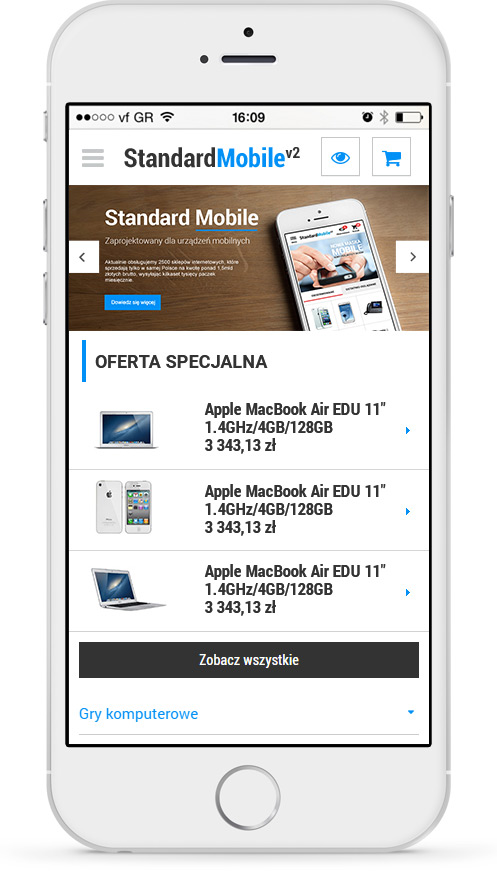
Czy potrafisz sobie wyobrazić życie, a tym bardziej biznes bez Internetu? Na pewno nie. Tak samo popularny powoli staję się Internet mobilny, który świetnie sprawdza się w codziennym użytkowaniu. Z roku na rok zauważalnie przybywa coraz więcej klientów, którzy wybierają mobilną formę robienia zakupów. Dla takich konsumentów liczy się przede wszystkim prosta nawigacja, przejrzystość i duża funkcjonalność strony mobilnej sklepu. W oparciu o te cechy IAI-Shop.com stworzyła mobilny sklep i specjalny szablon Standard Mobile, która została zaprojektowana w myśl najlepszych trendów wizualnych i funkcjonalnych.

- Szablon Standard Mobile jest gotowym rozwiązaniem, przeznaczonym do użytku dla wszystkich sklepów, niezależnie od branż w jakich działają. Szablon można również swobodnie zmieniać. Koszt takich zmian jest nieduży, ponieważ nie trzeba tworzyć szablonu od nowa, a jedynie przebudować pod indywidualne potrzeby. Ponadto dzięki funkcji mobilnej wersji strony, szablon Standard Mobile można zastosować jako rozwiązanie dla Twojej standardowej strony internetowej. Jeśli chcesz, by zarówno Twoja strona mobilna jak i standardowa były jak najbardziej zbliżone do siebie, a ich elementy znajdowały się w tych samych miejscach to rozwiązanie jest dla Ciebie.
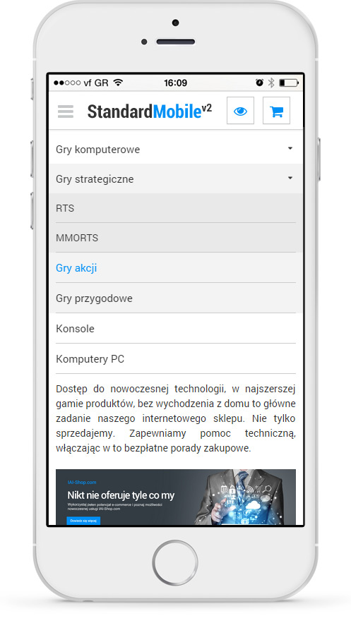
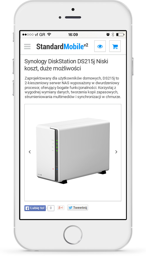
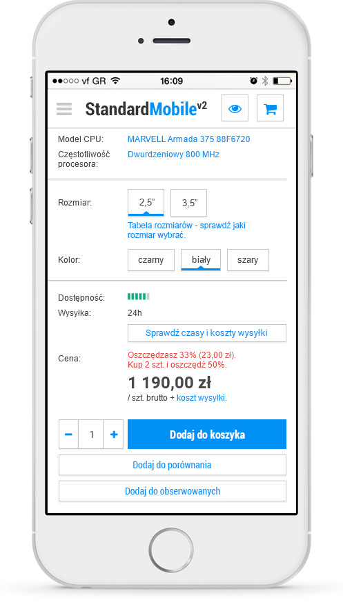
- Kolory szaty graficznej zostały dobrane z myślą o jak największej przejrzystości strony. Szata graficzna jest oparta na kolorze białym i szarościach dzięki czemu dobrze kontrastuję z tekstem i nie powoduję zmęczenia oczu klientów. Dodatkowe niebieskie akcenty podkreślają najważniejsze miejsca, na które konsument powinien zwrócić uwagę podczas przeglądania oferty i składania zamówienia
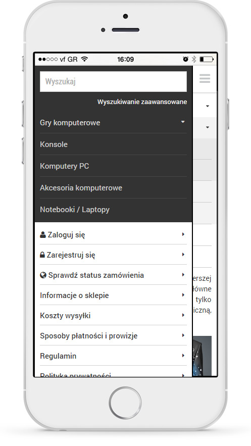
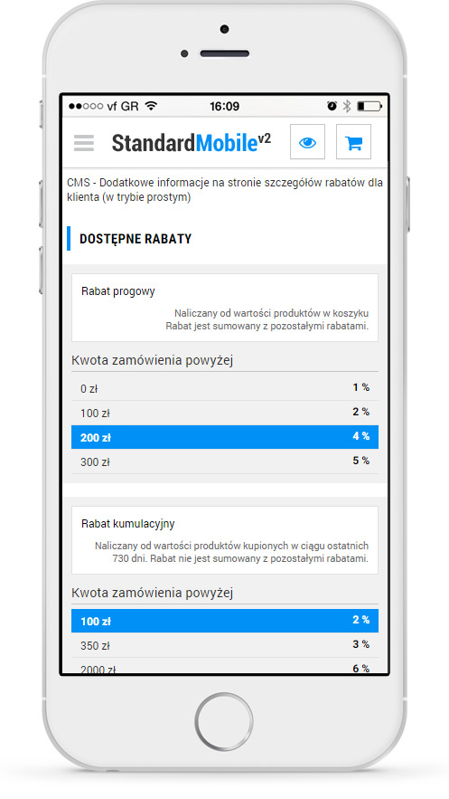
- Wiele funkcji, które posiada mobilny sklep IdoSell jest niedostępnych w standardowych rozwiązaniach, a ich wprowadzenie wymaga zatrudnienia specjalistów co wiąże się z dodatkowymi nakładami finansowymi. Na przykład jeśli prowadzisz sprzedaż zagraniczną nie musisz martwić się o dodatkowe tłumaczenie szablonu. Z IdoSell masz możliwość wyboru szablonu w języku polskim, angielskim oraz niemieckim.
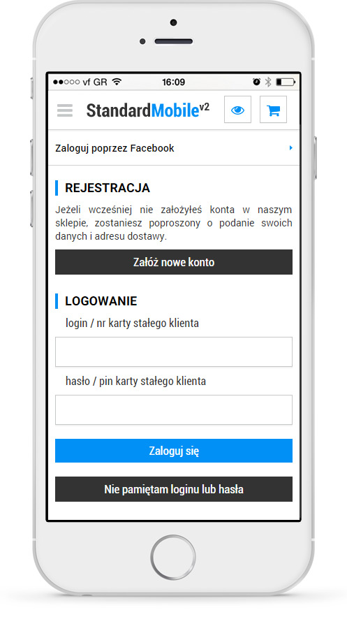
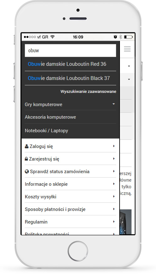
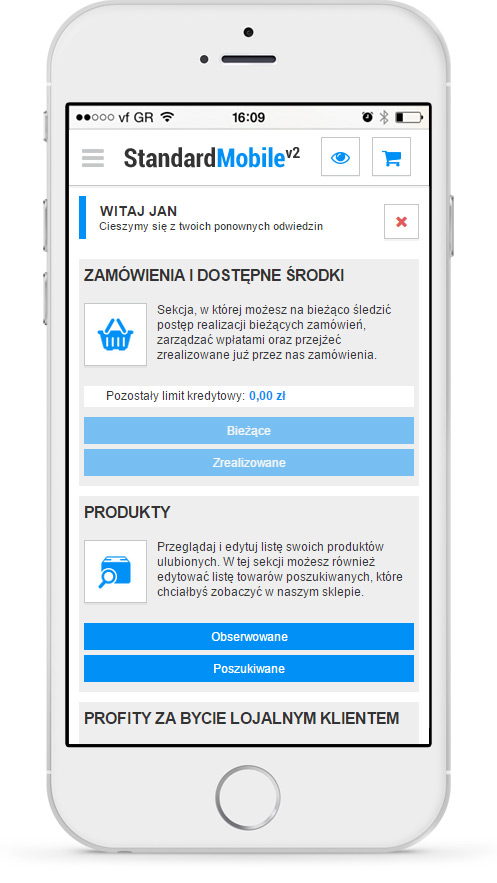
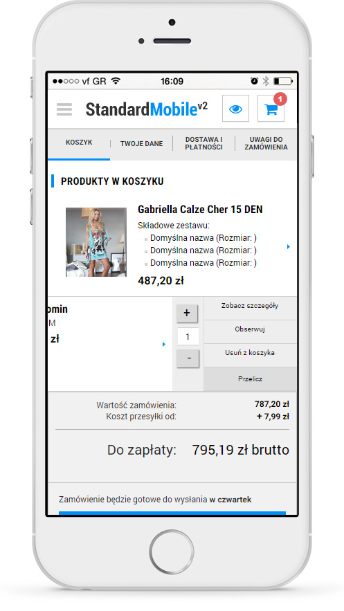
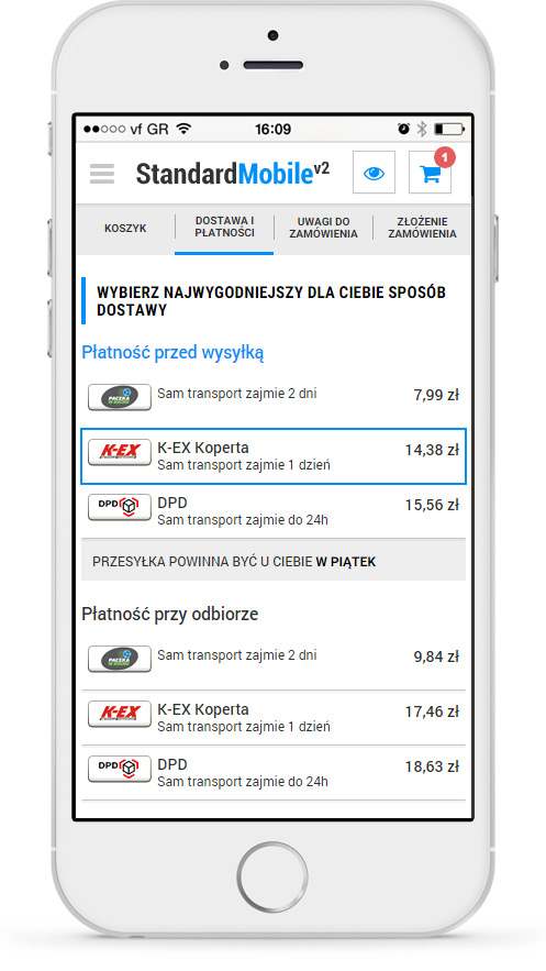
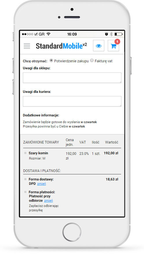
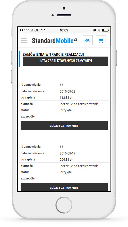
- Szablon Standard Mobile została zaprojektowana jako odbicie strony tradycyjnej. Jeśli więc Twój klient złoży zamówienie w Twoim sklepie internetowym, w każdej chwili może sprawdzić np. status realizacji zamówienia korzystając z mobilnej wersji sklepu. Standard Mobile jest interfejsem dotykowym, mimo to posiada wiele funkcji tradycyjnego szablonu graficznego. Dzięki temu Twoi klienci mają możliwość wyboru formy sklepu, która jest dla nich najwygodniejszym rozwiązaniem oraz mogą swobodnie przełączać się między kanałem internetowym a mobilnym.
- Szablon Standard Mobile cechuję się dużą kompatybilnością i dostępnością. Wersja mobilna działa na telefonach z przeglądarkami iPhone/iPod Touch Safari, FireFox, Chrome, Internet Explorer, Opera Mobile czy Google Android Browser. Ponadto posiada dużą optymalizacją pod urządzenia mobilne. Interfejs jest przystosowany do urządzeń zarówno z ekranem dotykowym, jak i bez niego, specjalny JavaScript i HTML oraz rezygnacja ze zbędnych dodatków, obciążających stronę to kilka z funkcji szablonu Standard Mobile.
- Dokładne opisy tych i pozostałych funkcji dostępne są w poniższej galerii.
Dostępne wersje językowe


Galeria z funkcjami