STANDARD RWD 3 template designed for online shops with fewer products and services
STANDARD RWD 3 is visually coherent with the existing templates RWD 1 and RWD 2 . The template is designed according to the latest market trends. STANDARD RWD 3 is very intuitive and user friendly. It allows for conducting effective marketing and promotional campaigns. It is especially recommended for online stores with a smaller assortment. Until recently, online stores with smaller offer could use the classic template RWD 1 and RWD 2 created for selling a wide assortment, which in some cases caused products to be invisible on the site. The alternative is One Page Shop , which may, however, turn out to be insufficient in case of many products. Now every IdoSell online store may use the RWD 3 STANDARD template.
What is our STANDARD RWD 3 template?
Here are some key features of STANDARD RWD 3.
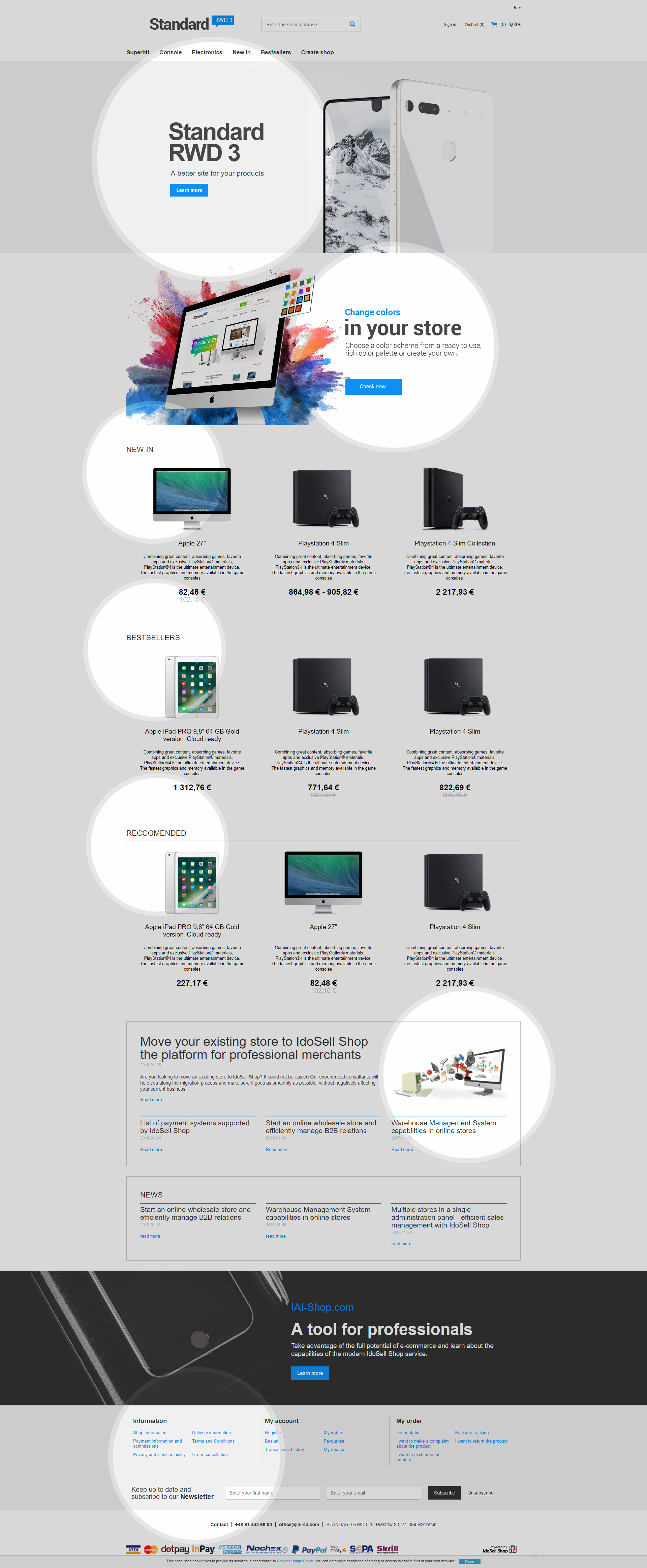
What distinguishes STANDARD RWD 3 from other templates is the way the products and content are presented. The layout is the most commonly used one-column solution allowing for the best presentation and reception of page content. The logo is more exposed in the template<!--0-->, making it more eye catching. Below, you can find our well-known main menu with the intuitive navigation. In the STANDARD RWD 3 template, the main banner area is not limited to the page content container and extends to the full width of the screen. Filters have been moved over search results. A banner area can be placed between products on the list. This solution allows you to focus on a particular product or particular product or service feature in the online store. The buttons for changing banners are within reach of the customer and constitute an intuitive solution. The RWD 3 product card has received an innovative look, breaking with the existing layout to expose the visual part of the product.
Another element is the hotspot zone. The large product photo with the name and short encouraging description of the product is designed to keep the viewer's attention while preserving the versatility of the template. Our graphic department can customize the hotspot zone according to your requirements at any time.
The blog zone is yet another attention-worthy element. The blog zone is intended to show the latest entry, presenting six consecutive entries below. We encourage you to use our mechanisms and write your blog. Including valuable content enriched with proper keywords can significantly improve your search engine position in Google. Publishing content corresponding to the online store profile can attract the attention of customers looking for such information. Users who visit and read the blog, may become your customers in the future.
Separating a photo gallery made it possible to place a large, catalogue photo of a product. Access to the gallery itself is based on the interaction with a dedicated button or main photo. Below you will find the most important features of the product, along with the functionalities of the store, which allow convenient and quick shopping. We have not forgotten about the ability to create, for example, product collections. The presentation of such offer has been thoroughly rebuilt.
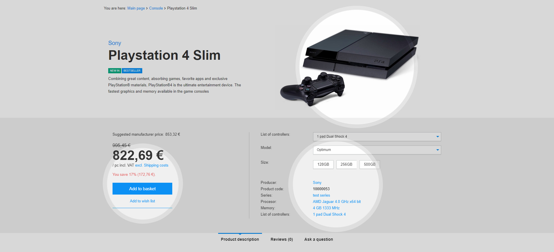
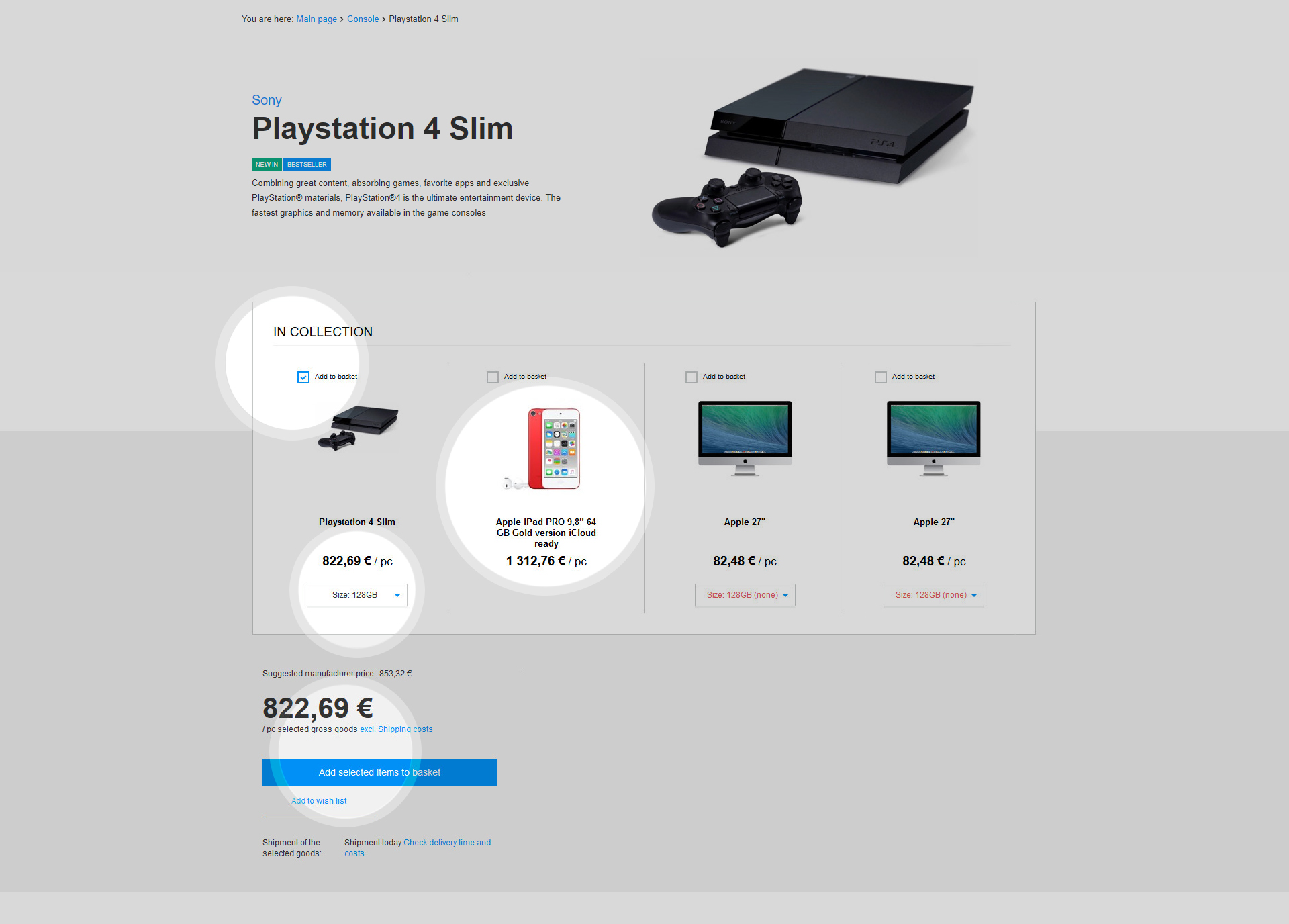
The form of product collection presentation has also been rebuilt. With fewer products, products from the collection are presented in a column layout, with large pictures and with full control for the customer in terms of selecting product parameters and collection elements. If a collection consists of more products, the layout changes, and the elements of the collection are presented in the form of a list.
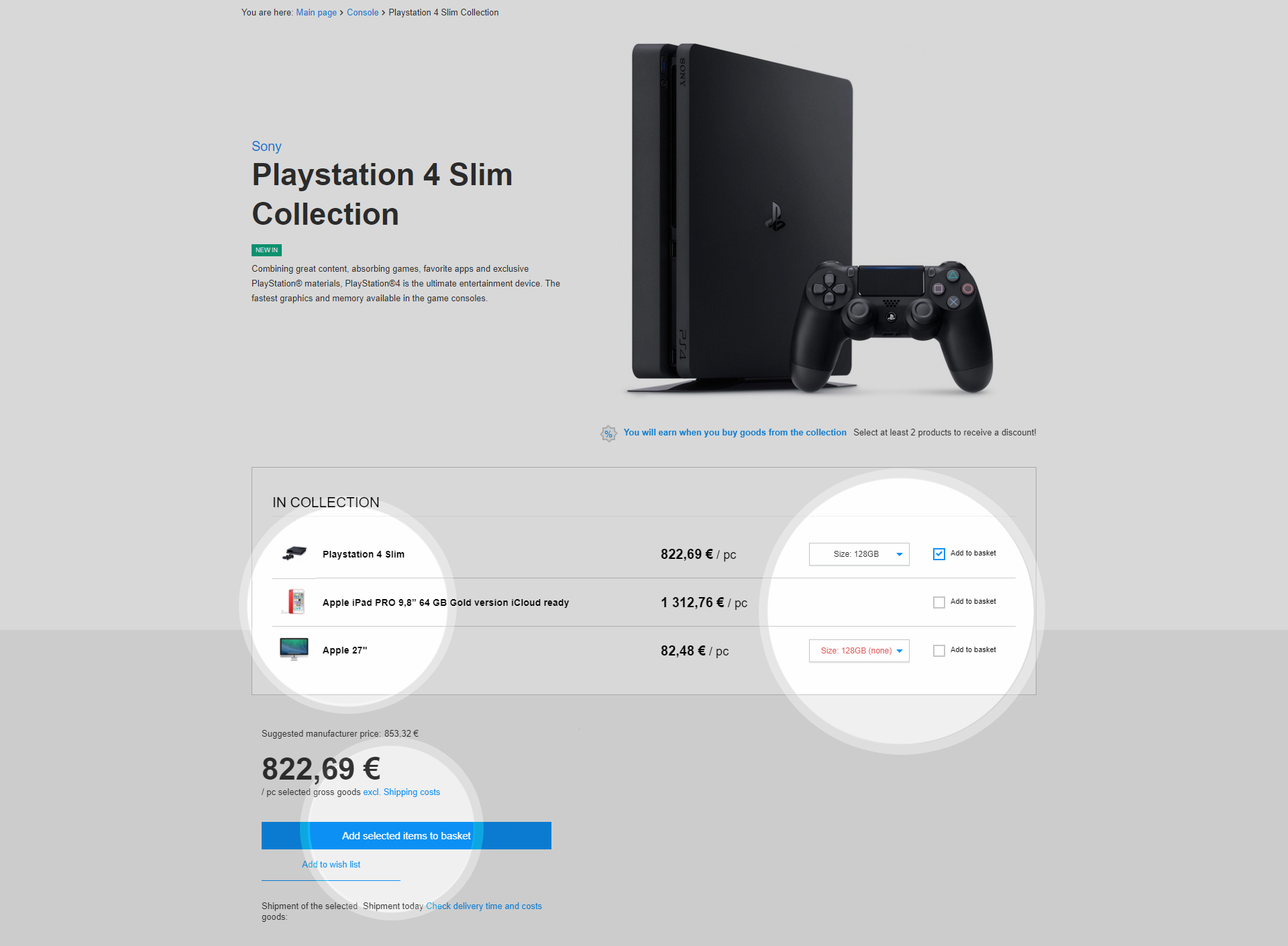
We have taken care of keeping the balance between the size of products photos in collection and their most important information and configuration possibilities. Both collection layouts are designed to achieve proper product presentation with the integration of purchasing mechanisms.
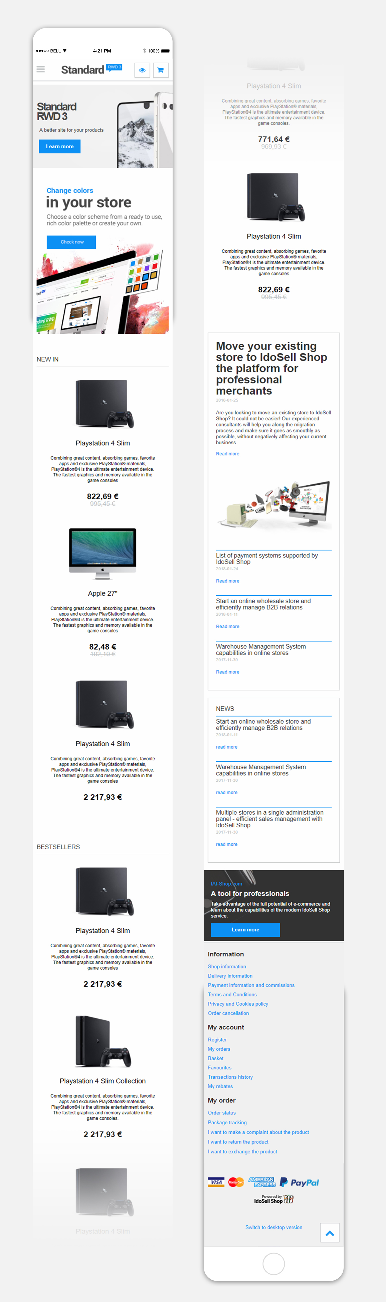
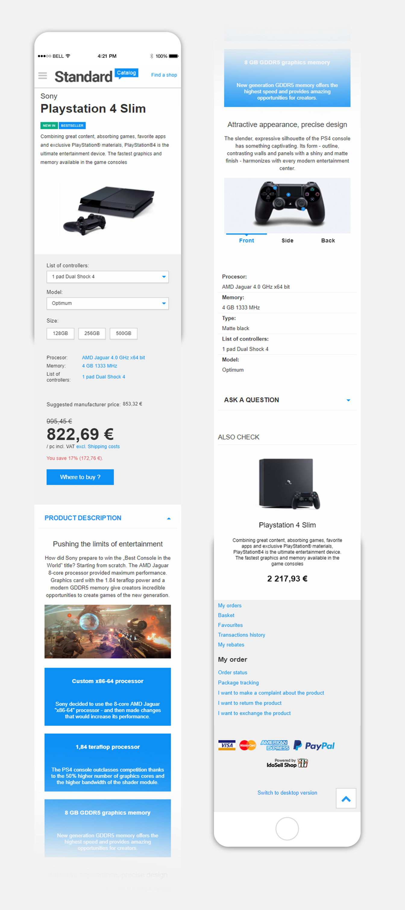
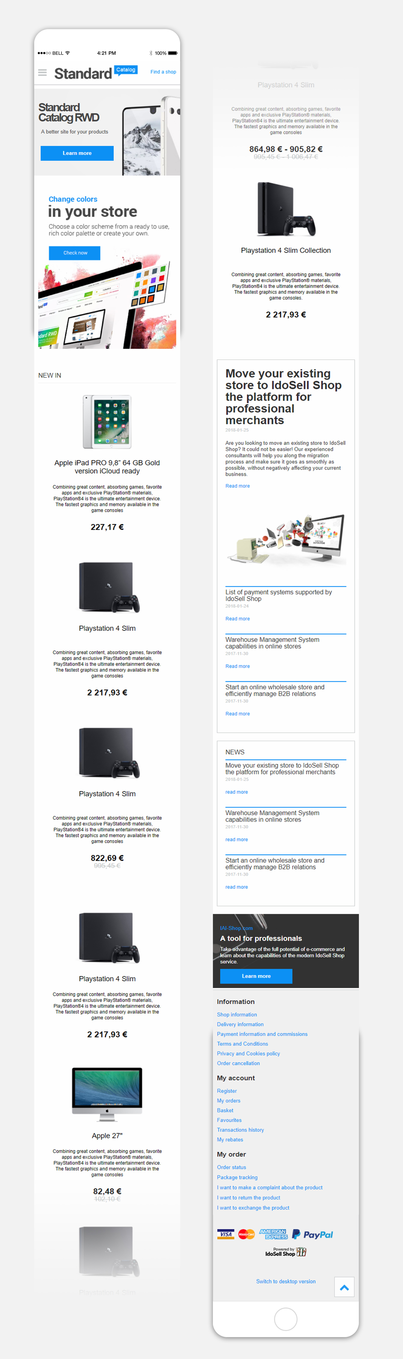
In the following example, there is another banner zone with the newsletter subscription just beneath these elements, the simplified footer emphasizes the character of the template and does not detract from the offer, providing only necessary information. The template is responsive. Below we present the layout of the main page in the version for smartphones.
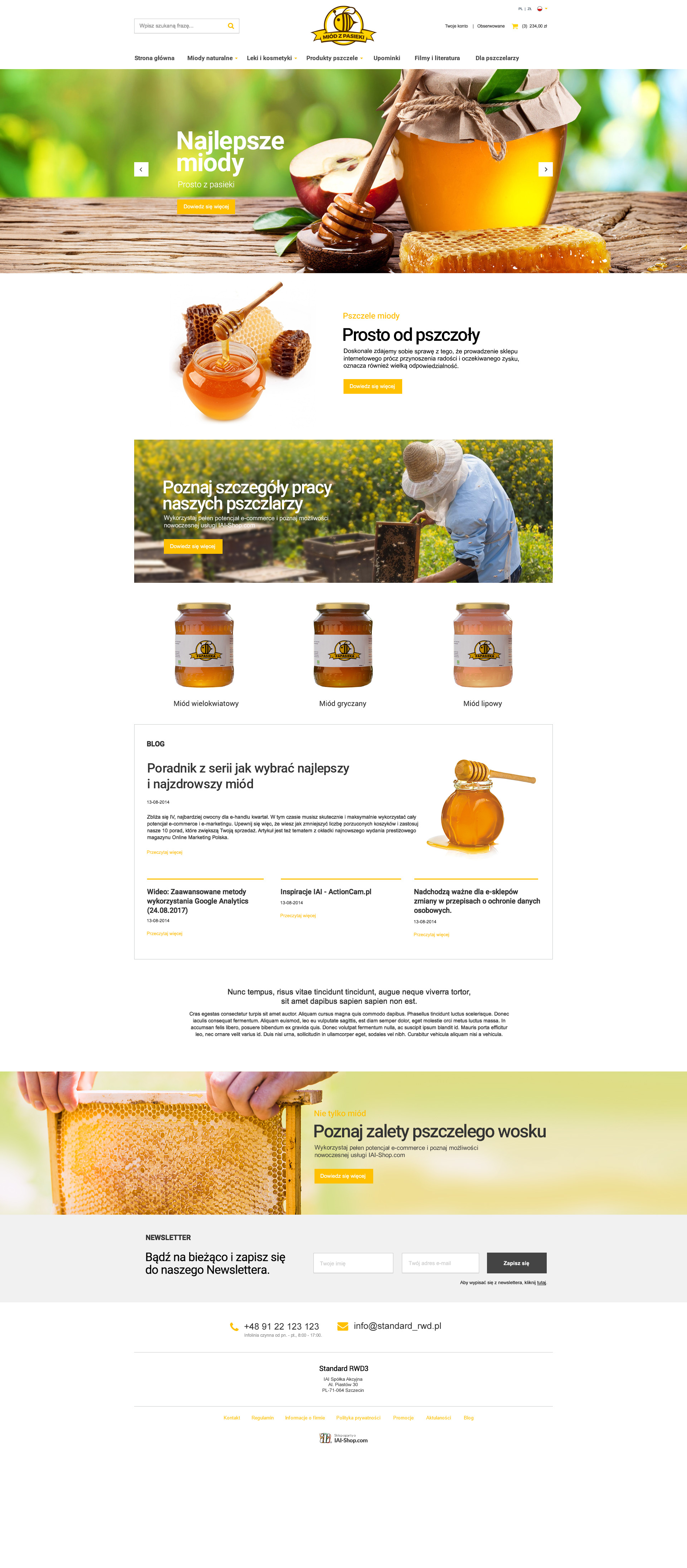
The STANDARD RWD 3 template has a huge potential for personalization for various business branches to present and run an online store. Below we present a graphic inspiration for presentations of beekeeping products. Minor color adjustment and the quality of graphics and banners gave the unique nature of the template while retaining clarity and functionality of the template.
How can you customize the STANDARD RWD 3 template?
Do you have more requirements concerning the appearance or functionality of your store? As our customer, now you have a template that is the starting point for your individual shop design. During the implementation of your online store it will no longer be necessary to come up with the basics of how such an online store should work and what elements it should contain. Just start with a ready, verified pattern and make only those modifications that will bring it closer to your needs, whether in terms of style and color, or functions and placement of items. Any change in appearance or adding additional functionality can be discussed and commissioned to our graphic department. Thanks to the excellent knowledge of the system, our specialists will take care of correct and trouble-free implementation.