A ready-to-use responive template will provide a proper display of your shop on all devices
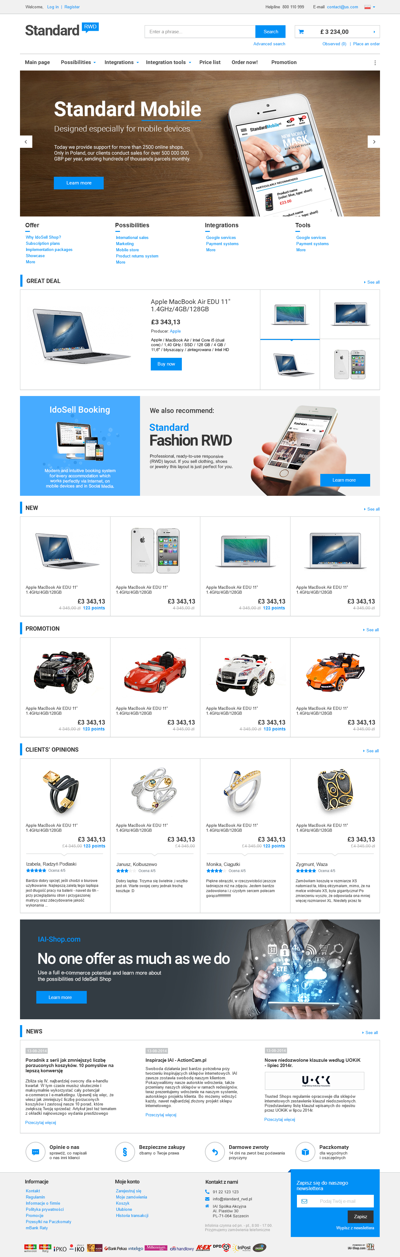
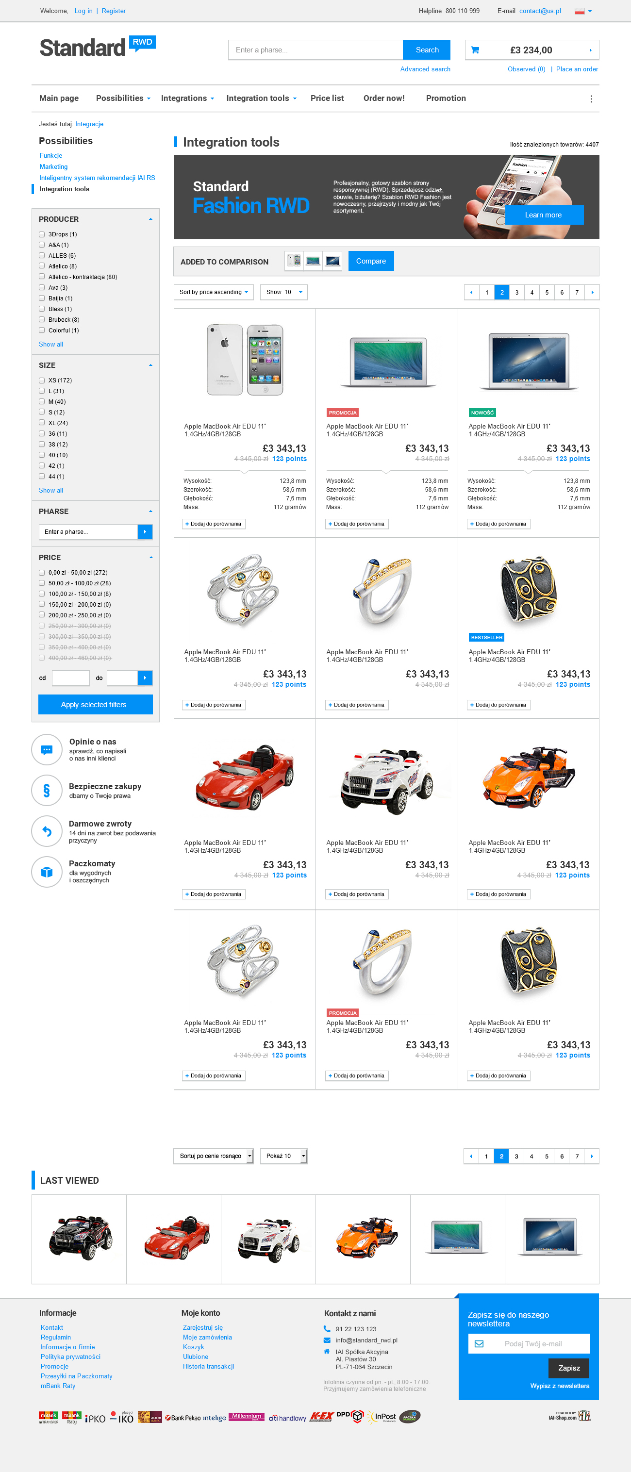
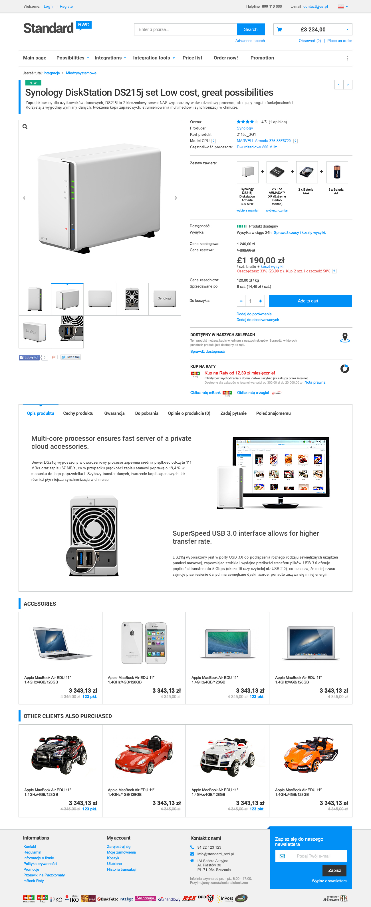
- STANDARD RWD is a ready-to-use layout for which there are no additional payments. Every user of IdoSell can set this layout in a shop. What distinguishes it from classic layouts is the capability of adapting to size of a device from which it is accessed. Standard RWD layout changes in a way to always present your offer in a clear and aesthetic way, and to make it possible for your customers to place an order regardless of the device. It is equally easy to place an order on a smartphone, a tablet, a laptop or a big screen computer.
- Colours of the layout have been chosen carefully to ensure the best legibility and lucidity. A graphic style has been thought through so all elements of the mask display equally good on each device type. They are coherent and for this reason it does not matter which screen size displays the website of your shop.
- STANDARD RWD is a layout on the basis of which we will design your individual layout with your trademark colours and functions chosen in regard to your needs. Designing an individual RWD layout is charged additionally like designing a classic shop's layout. When ordering individual changes you can always use information about implementation packages.
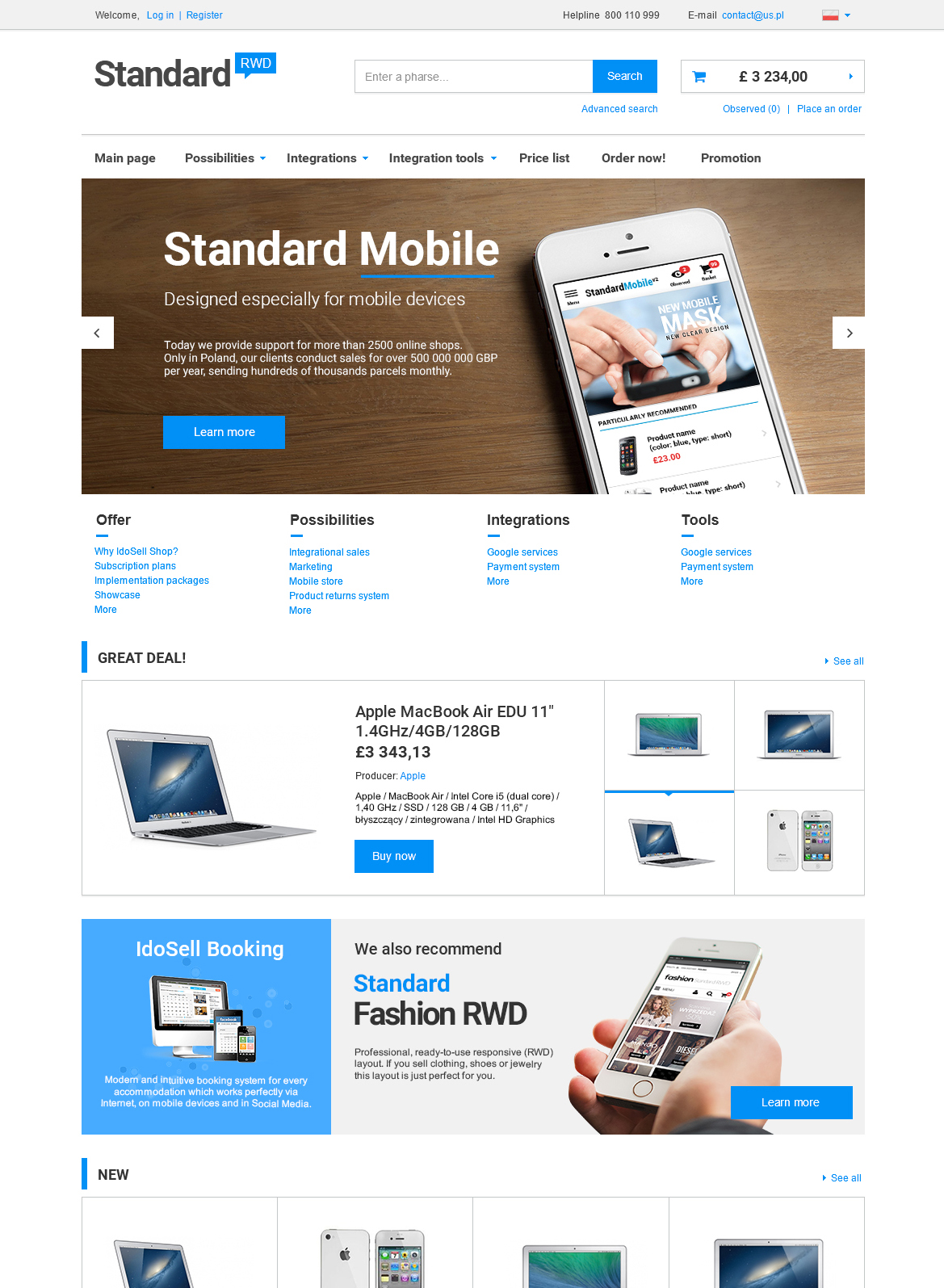
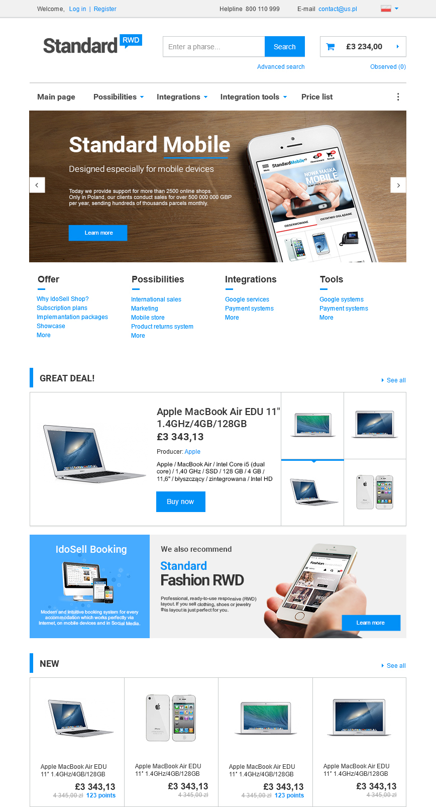
- Standard template contains three different arrangements of elements. They change along with the change of a screen width. If you view a shop page on a large screen computer or a big laptop, you will see a version with the width of 1170 pixels. In case of a smaller laptop or a tablet held horizontally it will usually be a 970 pixels versions. Another version's width is 750 pixels which is perfect for smaller tablets or large tablets in a vertical position. If a screen width is smaller than the two mentioned before, the website will be displayed with the width of 480 pixels, which is the width corresponding with the majority of modern smartphones. If a customer accesses your website from yet a smaller device, the website will always fit into this screen and will not exceed the visible space.
- STANDARD RWD is a solution compatible with, and optimized for, the biggest number of devices. RWD STANDARD layout displays on computer screens, laptops, mobile phones and tablets. For more details please check the technical aspects.
Available language versions:


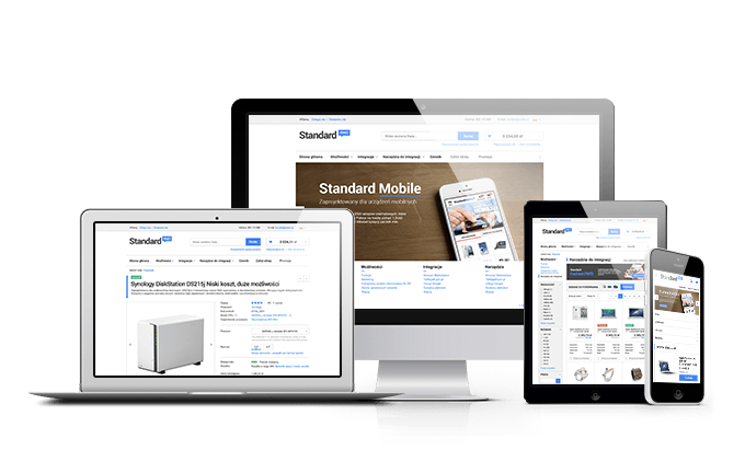
Gallery comparing the layouts on devices with different screen sizes.


STANDARD RWD layout - a gallery of designs
Photos below are sample visualizations containing banners, ads, links and logos introduced for the purpose of the presentation. You can commission our graphic designers to prepare individual banners, logos, photo gallery, information or a lookbook for you - all these elements can make your shop even more attractive for the customers.
Preparing photos and banners
STANDARD layout does not include banner ads, infographics or logos. These are the elements which should be characteristic for your offer and thus, properly adjusted. Even if you use a free STANDARD layout, our best graphic designers are at your disposal - they can design and implement a logo or individual banner ads to your shop.
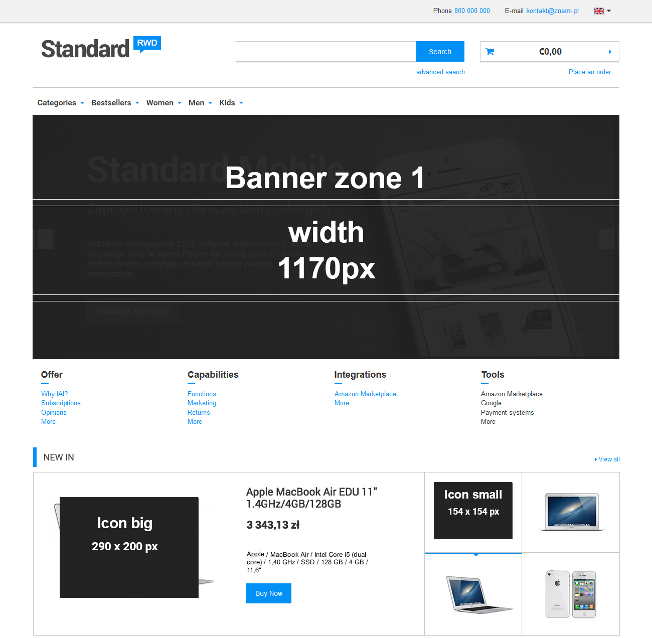
If you would like to prepare graphics for banner zones yourself or commission it to a third party, please check which dimensions enable diplaying graphics in a most accurate way. The dimensions are given in pixels, starting from the width, and are marked on the screenshot below. They show places where the most important zones for self-management in the administration panel are.
Best dimensions for product icons and photos, which you can introduce to your offer, are marked in a similar way. We recommend using similar proportions and maximum dimensions when using a standard layout in your shop. Please remember that if you commission designing an individual layout, optimal dimensions of medium and small photos, as well as icons, can be different than the ones presented on the screenshots below.
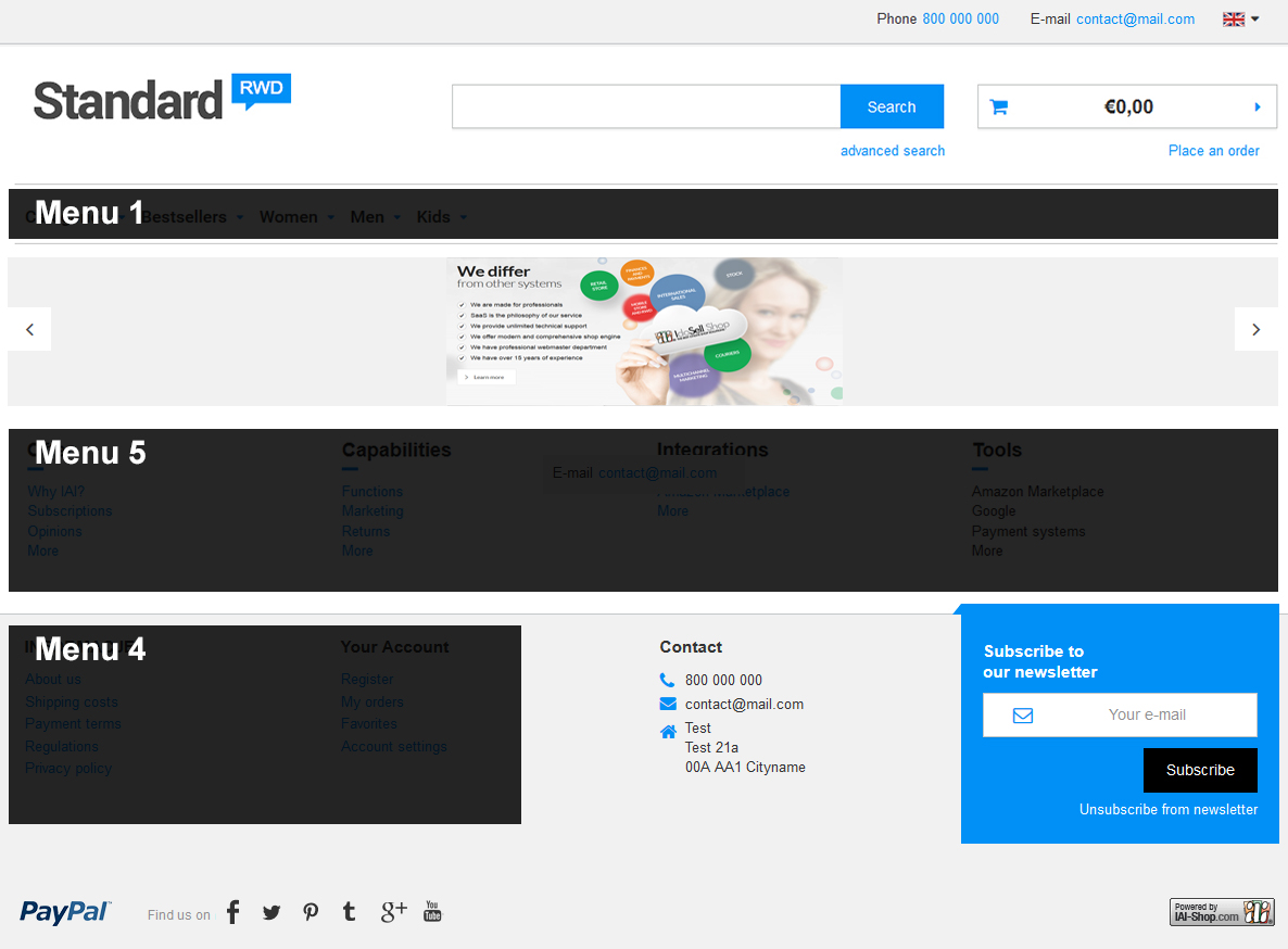
Building navigation and placing important links
STANDARD RWD layout supports three, from maximum five, possible navigation Menus. Illustration below indicates in which parts of a website individual Menus are displayed after setting them in the administration panel. Each navigation Menu can lead to product lists, information subpages and also include headers, not links. Our Graphics Department can add additional navigation Menus to your layout in specified places or change the behavior of existing Menus. A number of settings concerning menu behavior is available in the administration panel and does not require additional works performed by our graphic designers.