Responsive graphic design template assures great design of your shop on all devices
Professional and ready-to-use responsive website (RWD) template. Do you sell clothes, shoes or jewellery? RWD Fashion template is modern, lucid and trendy just like your shop!

- STANDARD RWD Fashion is a graphic layout available without any additional charges which can be used by every online shop on IdoSell platform. What makes it different from classic graphic layouts is its ability to adapt to the size of a device on which it is displayed. The design of a shop in which such layout is installed adjusts to a device and your offer is always presented in a lucid and intelligible way. What is more, it enables placing an order easily, regardless of the device. The process is equally easy on a phone, tablet, laptop or a PC with a big screen.
- Colours and design were chosen is such a way to keep up with the latest trends in webdesign. Simple colours, mainly black and white, and so-called Flat Design, enable to effectively display high-quality product photos and products presented. The greatest advantages of this layout are: lucidity, simplicity and a great display of product photos.
- Standard template is a good starting point for creating individually-looking shops selling clothes, shoes, leather goods, jewellery and fashion accessories. You can order adjusting colours to your brand image, but you can also pick out functions matching your business. Individual versions are designed at additional charge – just like classic shop layouts. When ordering individual changes, you can always make use of implementation packages.
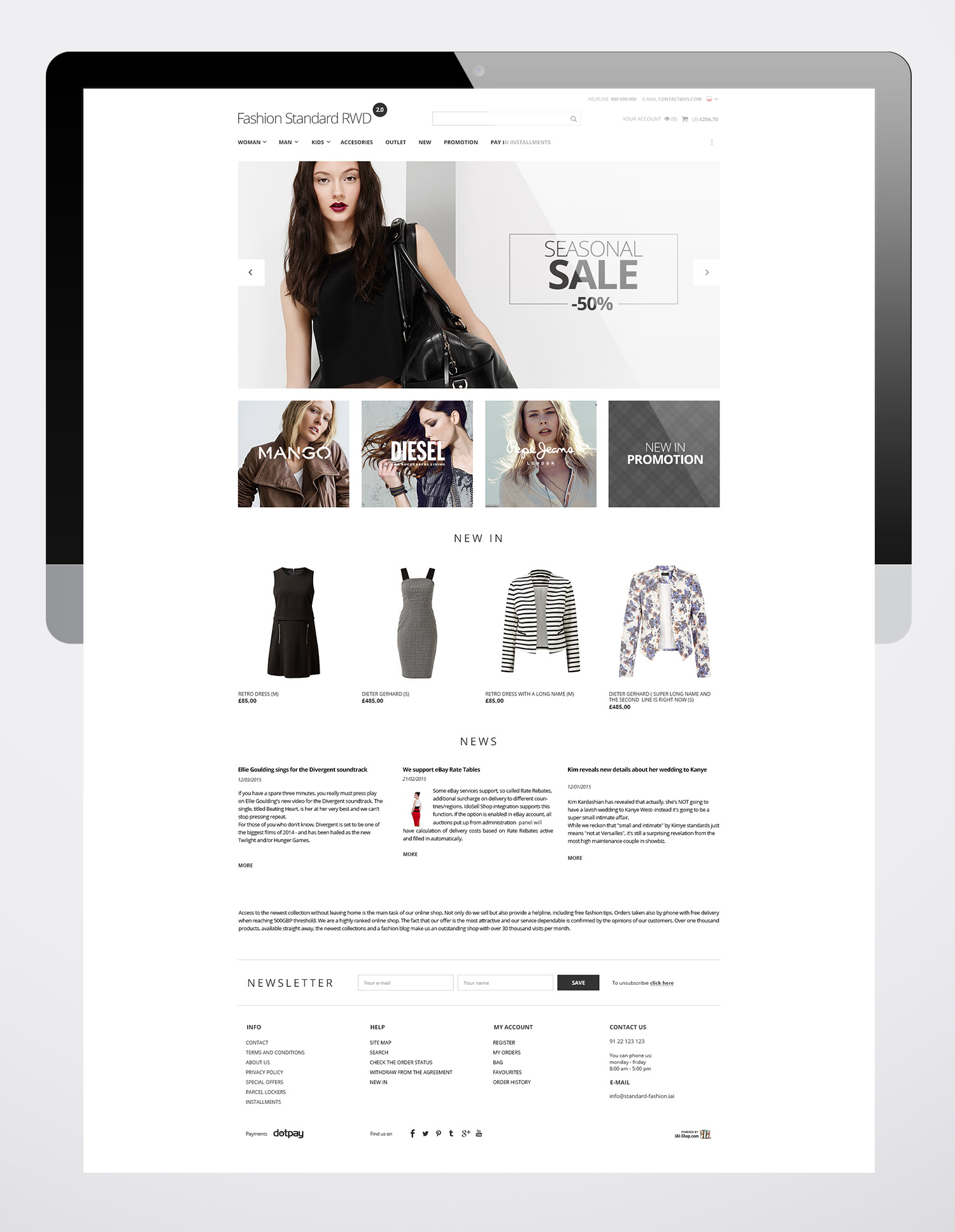
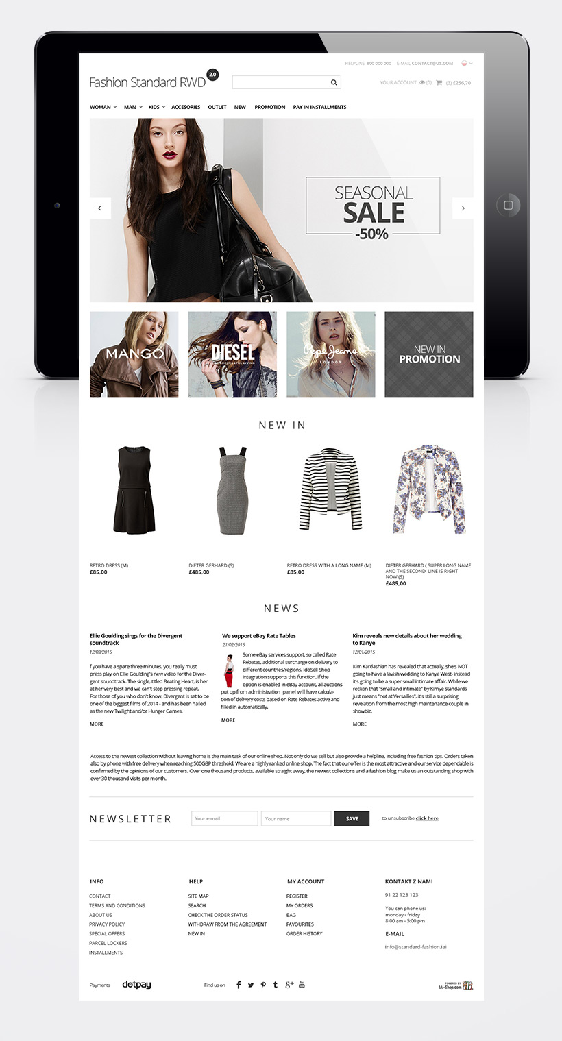
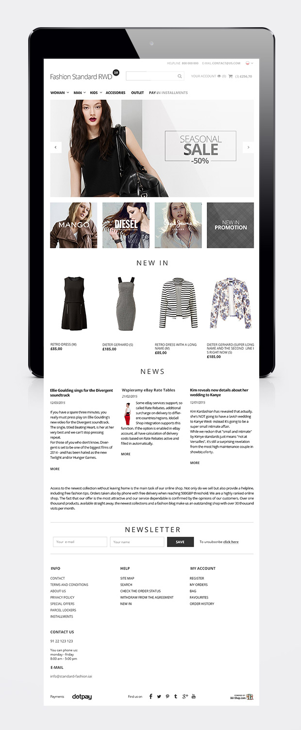
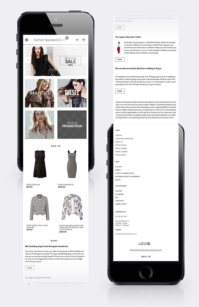
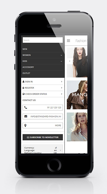
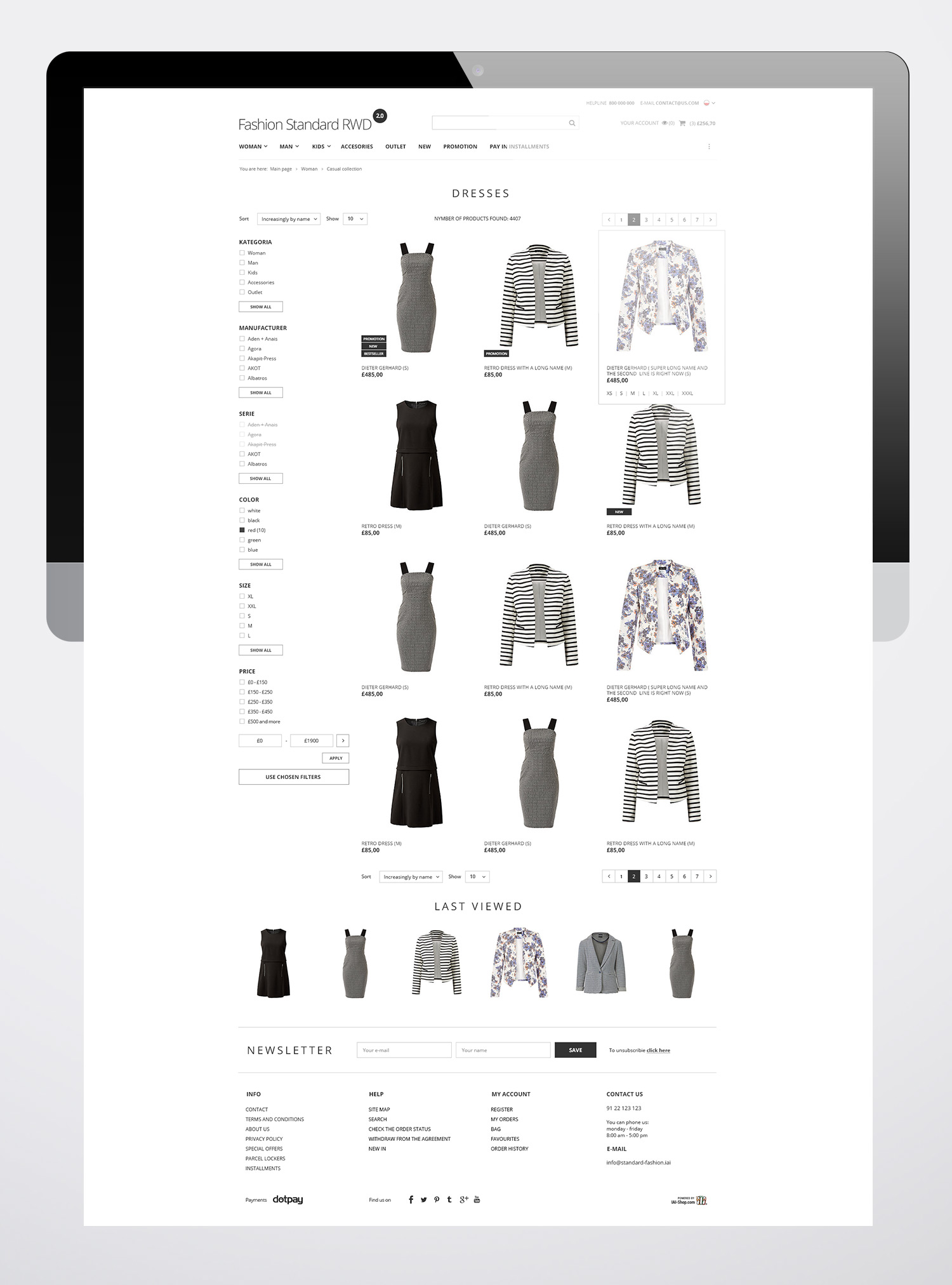
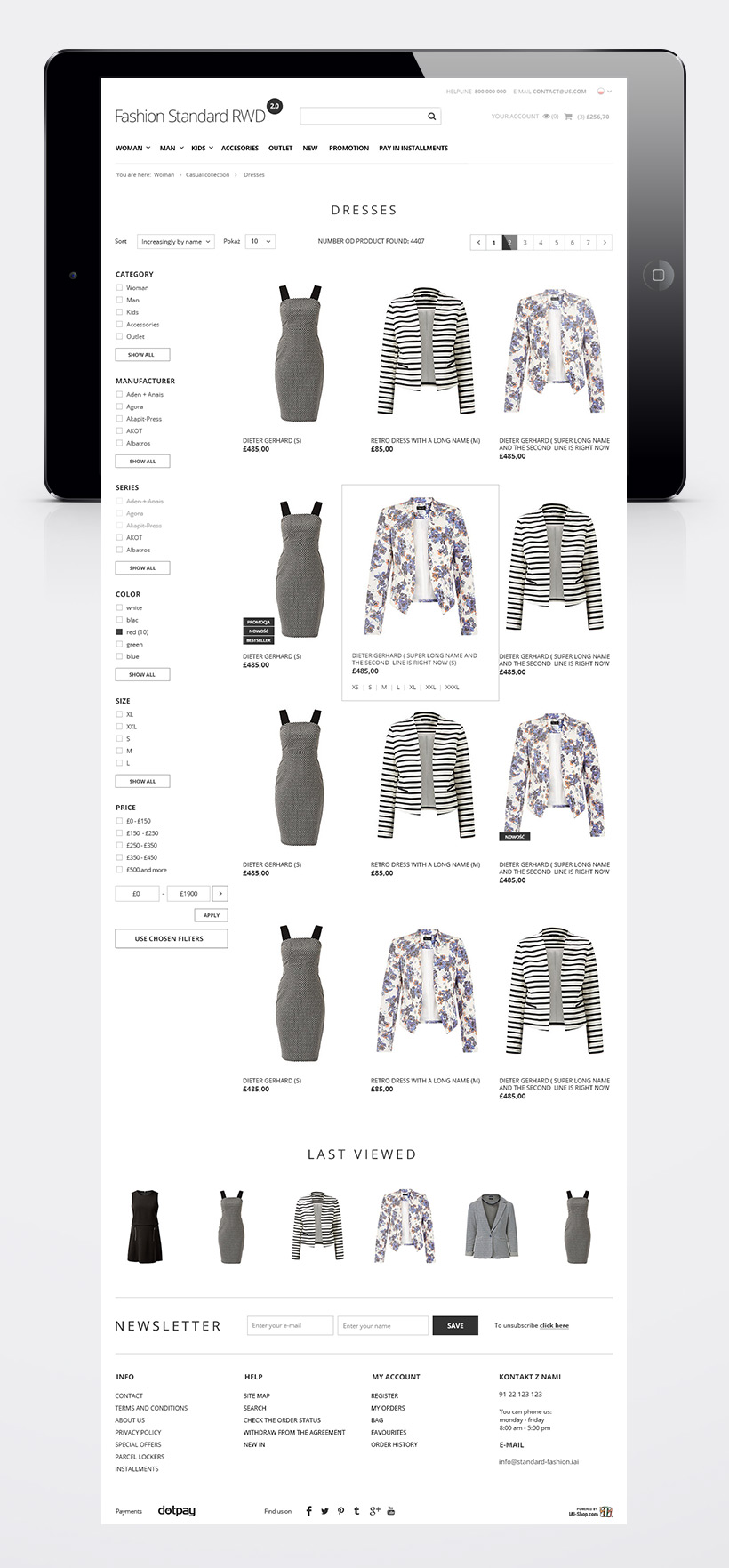
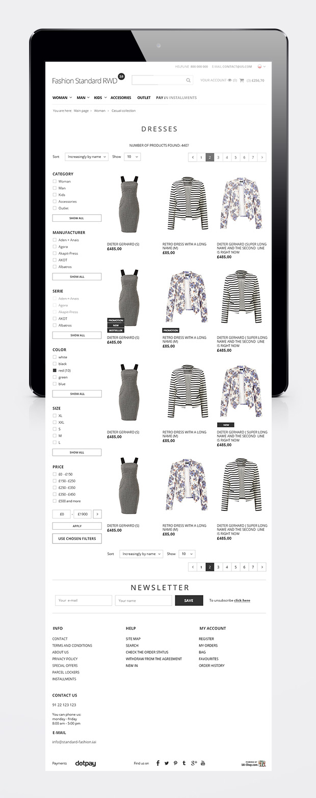
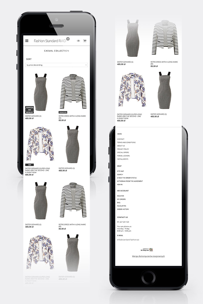
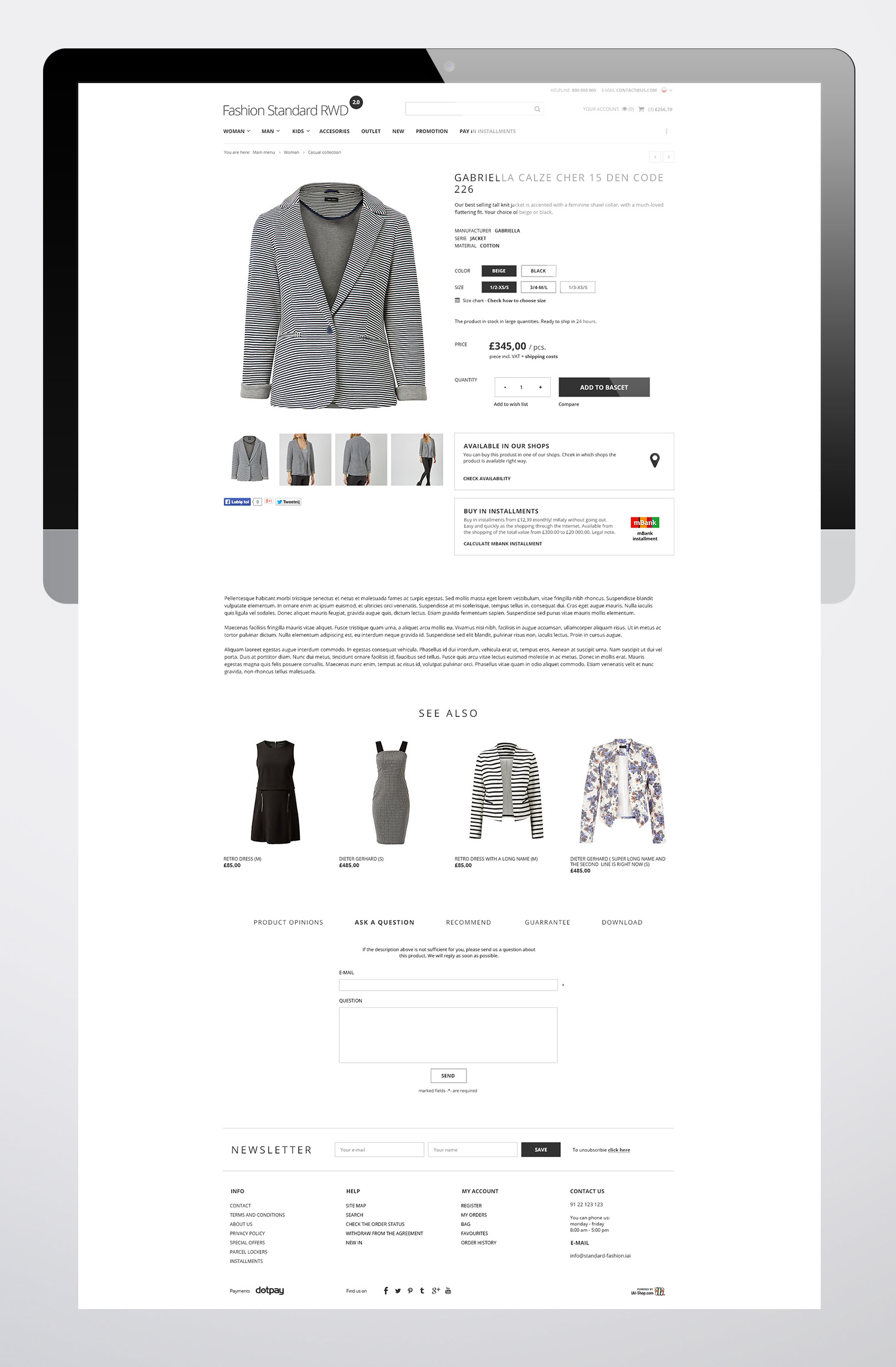
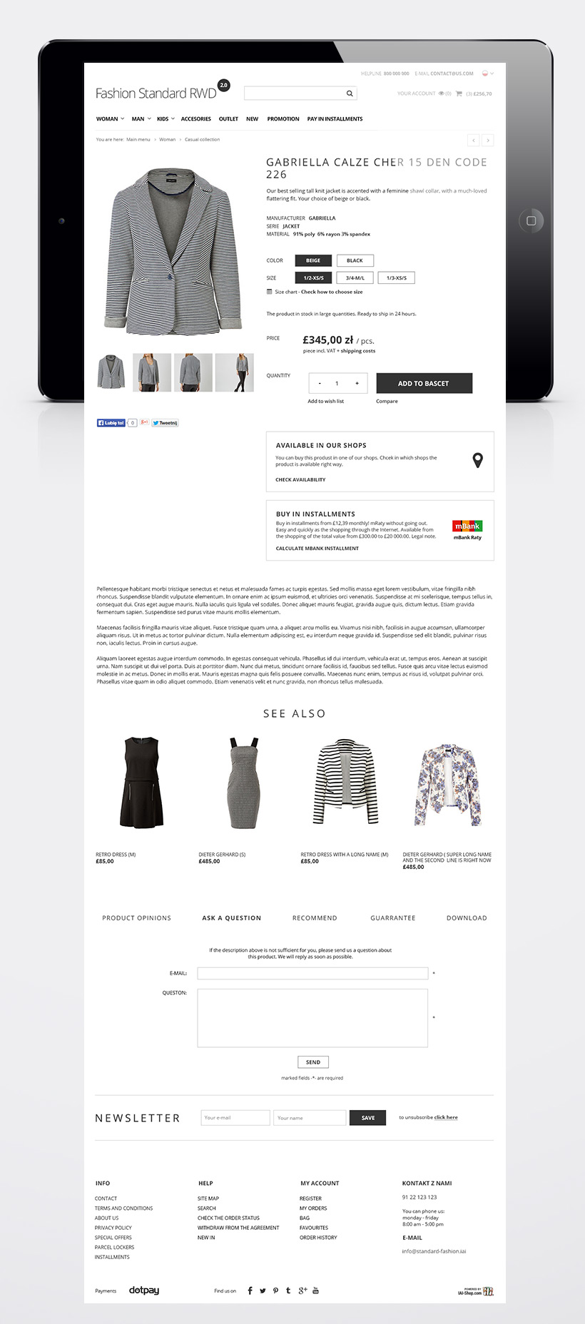
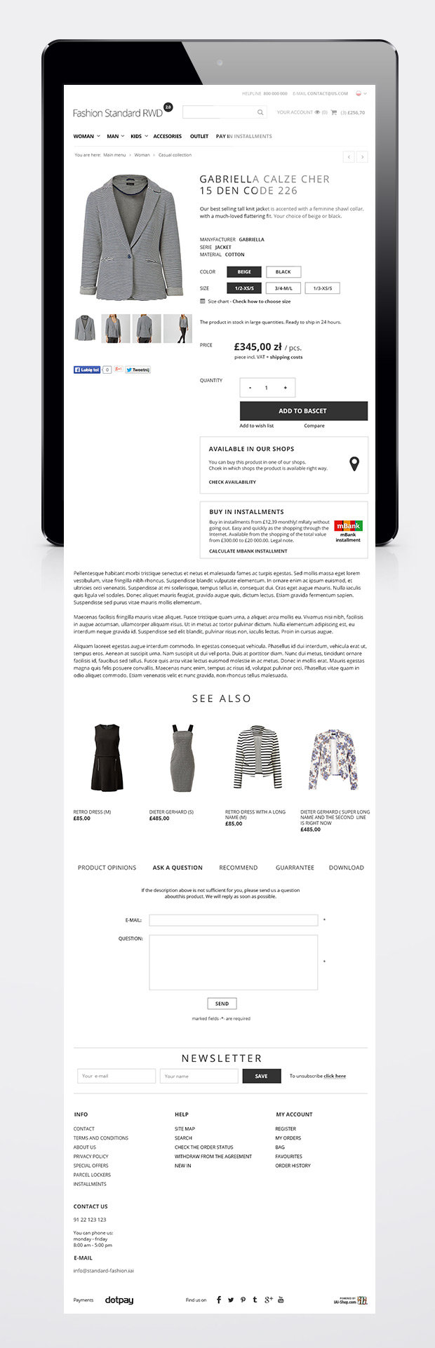
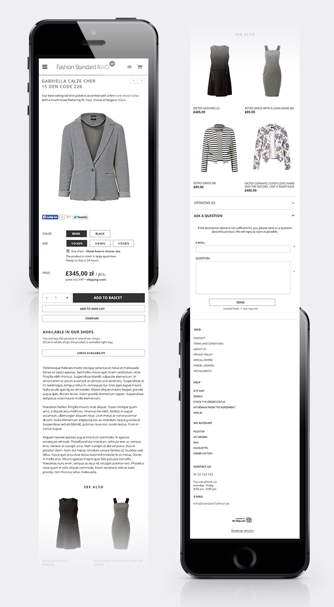
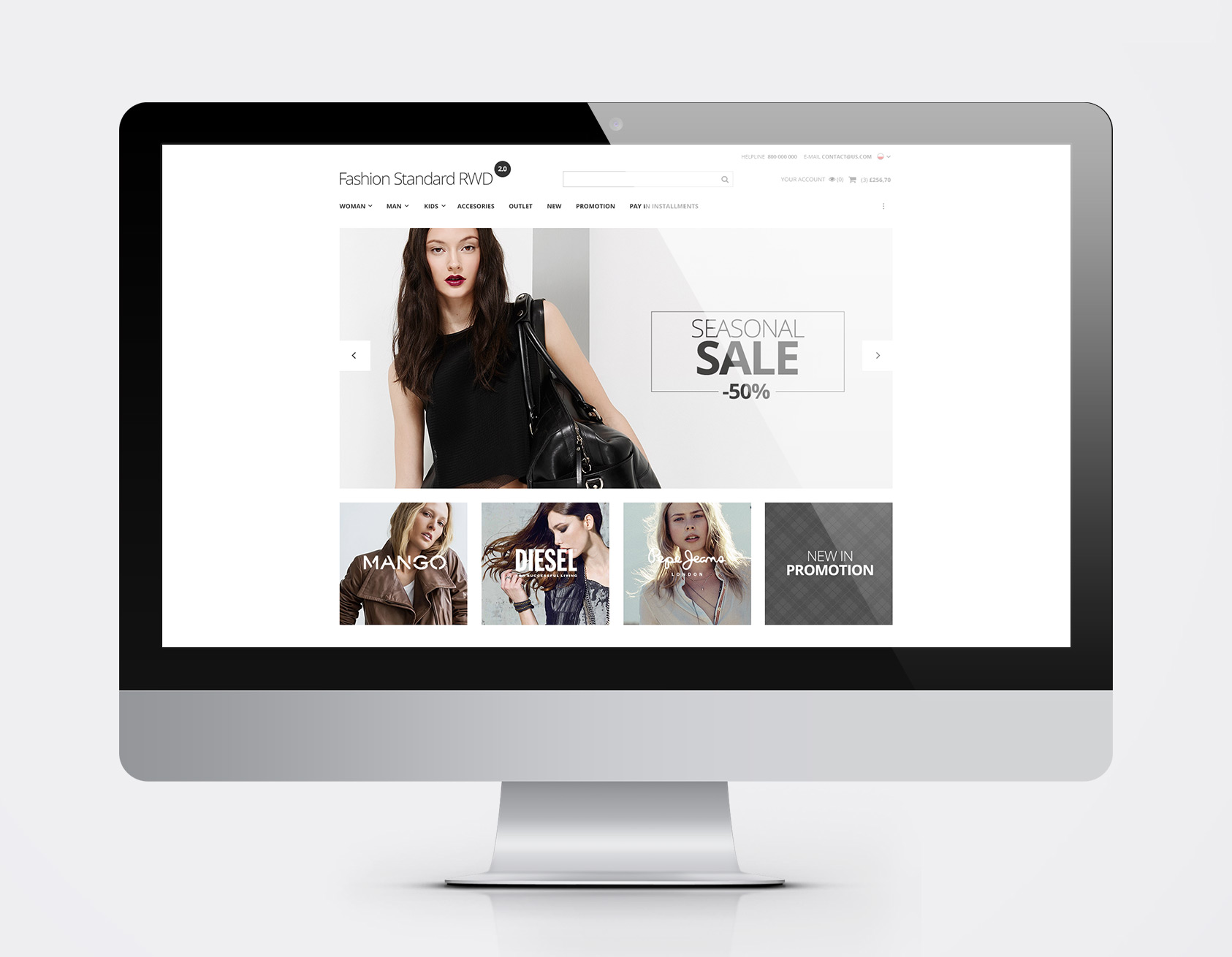
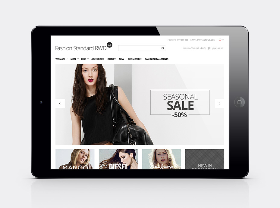
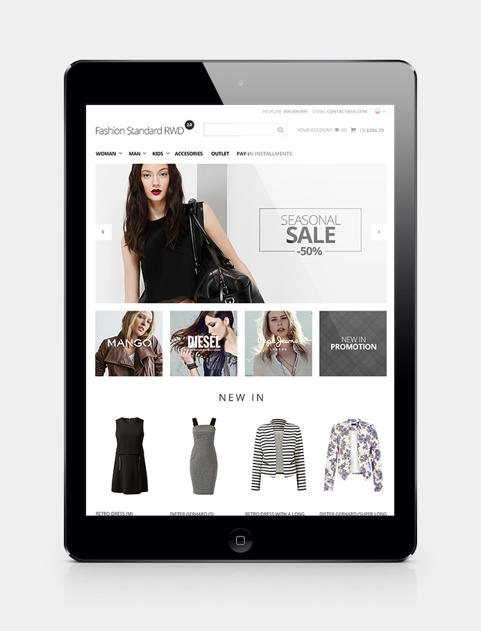
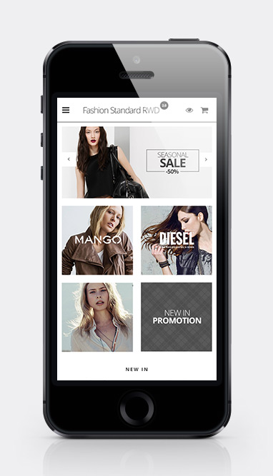
- Responsive layout includes four different arrangements of elements which change along with the changes of the screen width. If you view the shop page on a very big monitor or a TV, it widens to 1170 pixels. If you access a shop on a small PC or a big laptop you can see a version with the width of 980 pixels. Another version has the width of 768 pixels, what corresponds with the width of smaller tablets or large tablets in a vertical position. If the screen width is even smaller, your shop is displayed in 480-pixels width, adjusting to the screens of many modern smartphones. If a customer accesses your shop from even smaller devices, a website will always display on the full screen width and will perfectly fit into it.
- Standard RWD Fashion is the solution fully compatible with and optimized for the greatest number of devices. Shop based on STANDARD RWD works on PCs, laptops, mobiles and tablets. To learn more, please visit the technical aspects.
Available language versions


Gallery presenting four different arrangements of elements for devices with different screen sizes
Gallery of all Fashion layout designs
Photos below are just samples. Please remember that you can commission our graphic designers to prepare individual banners, logos, informational subpages, so that your shop will look as eyecatching as the simulations below.